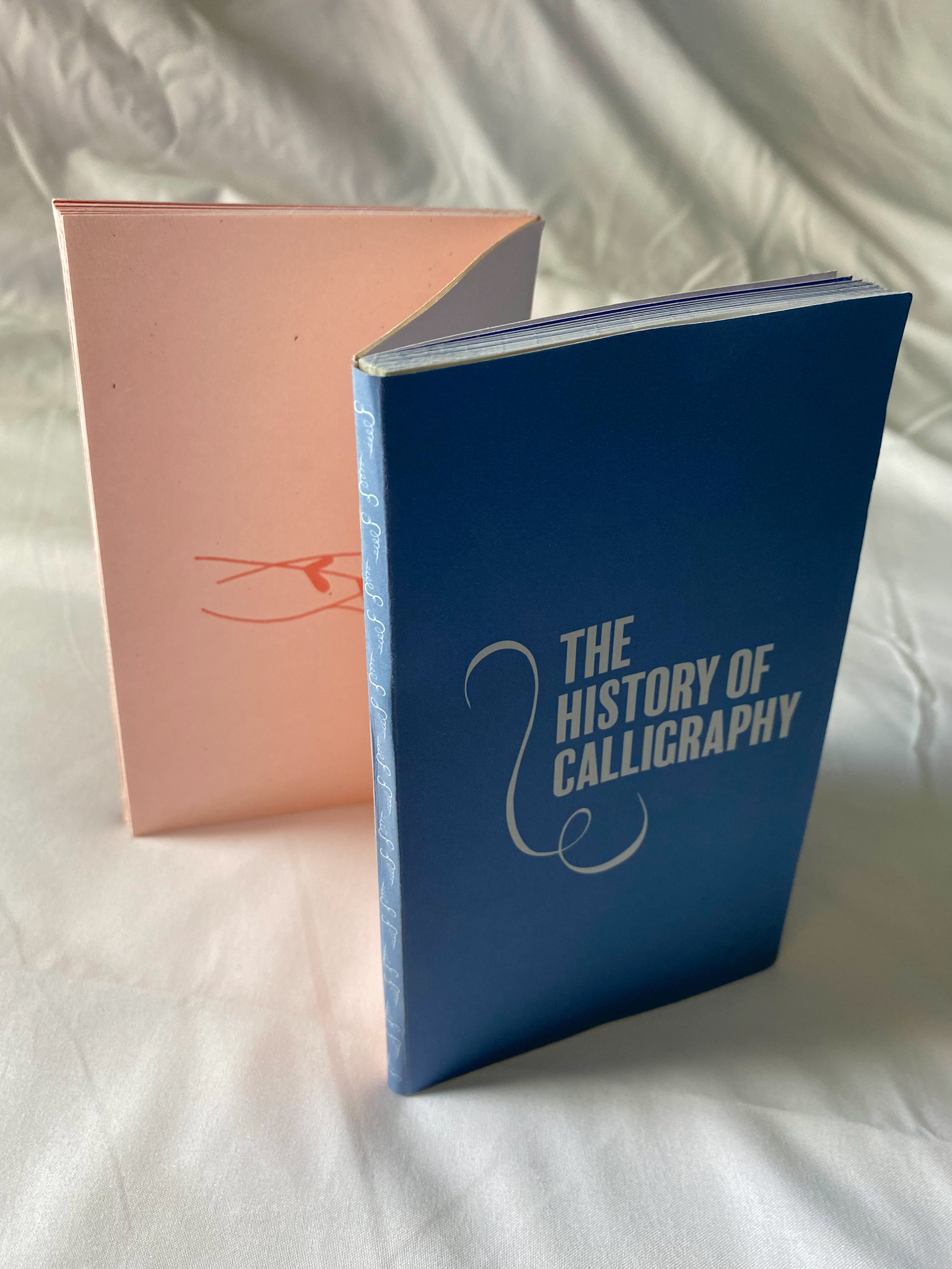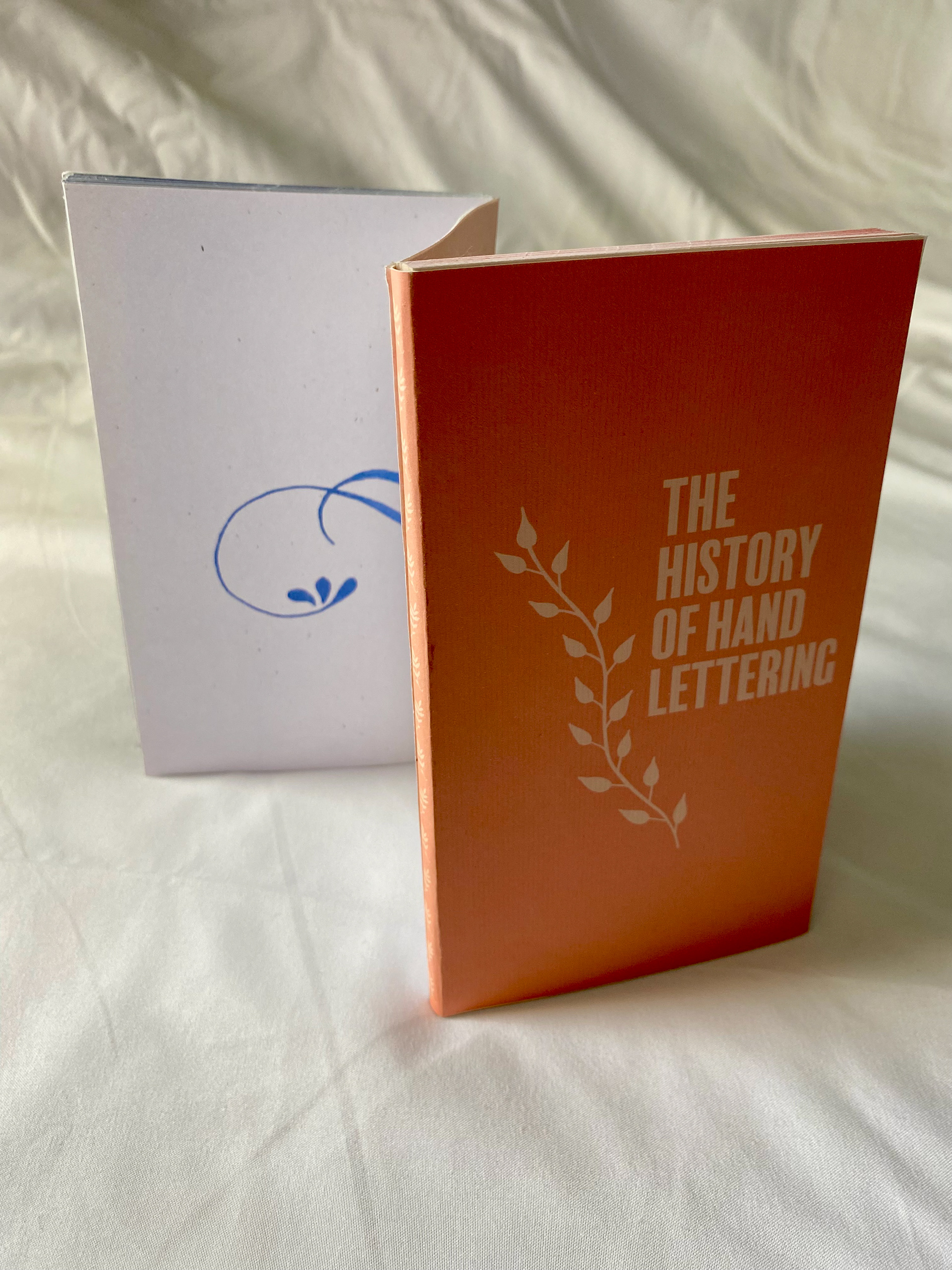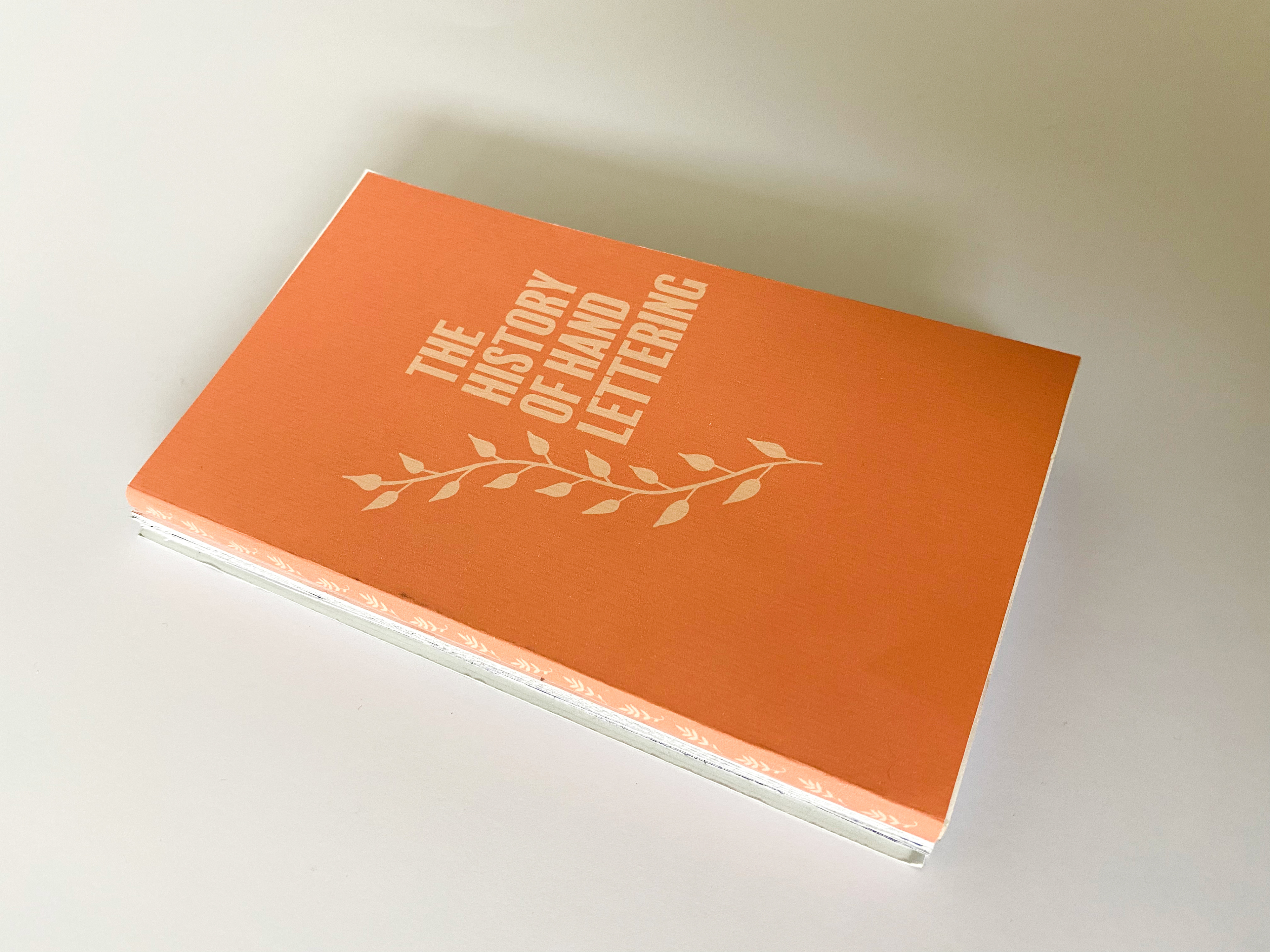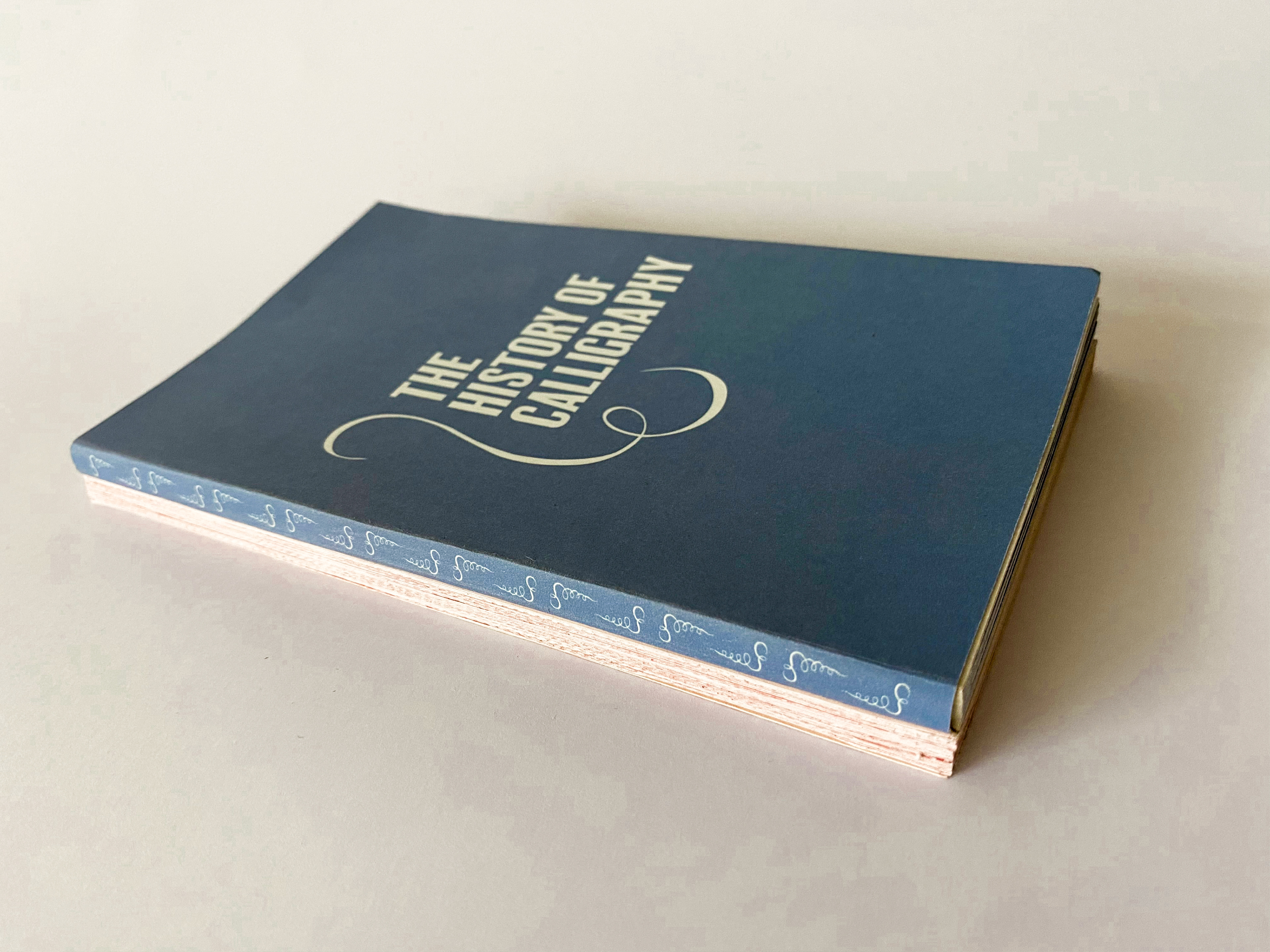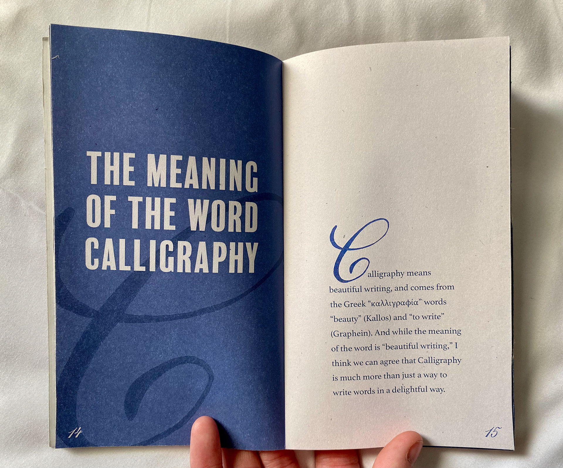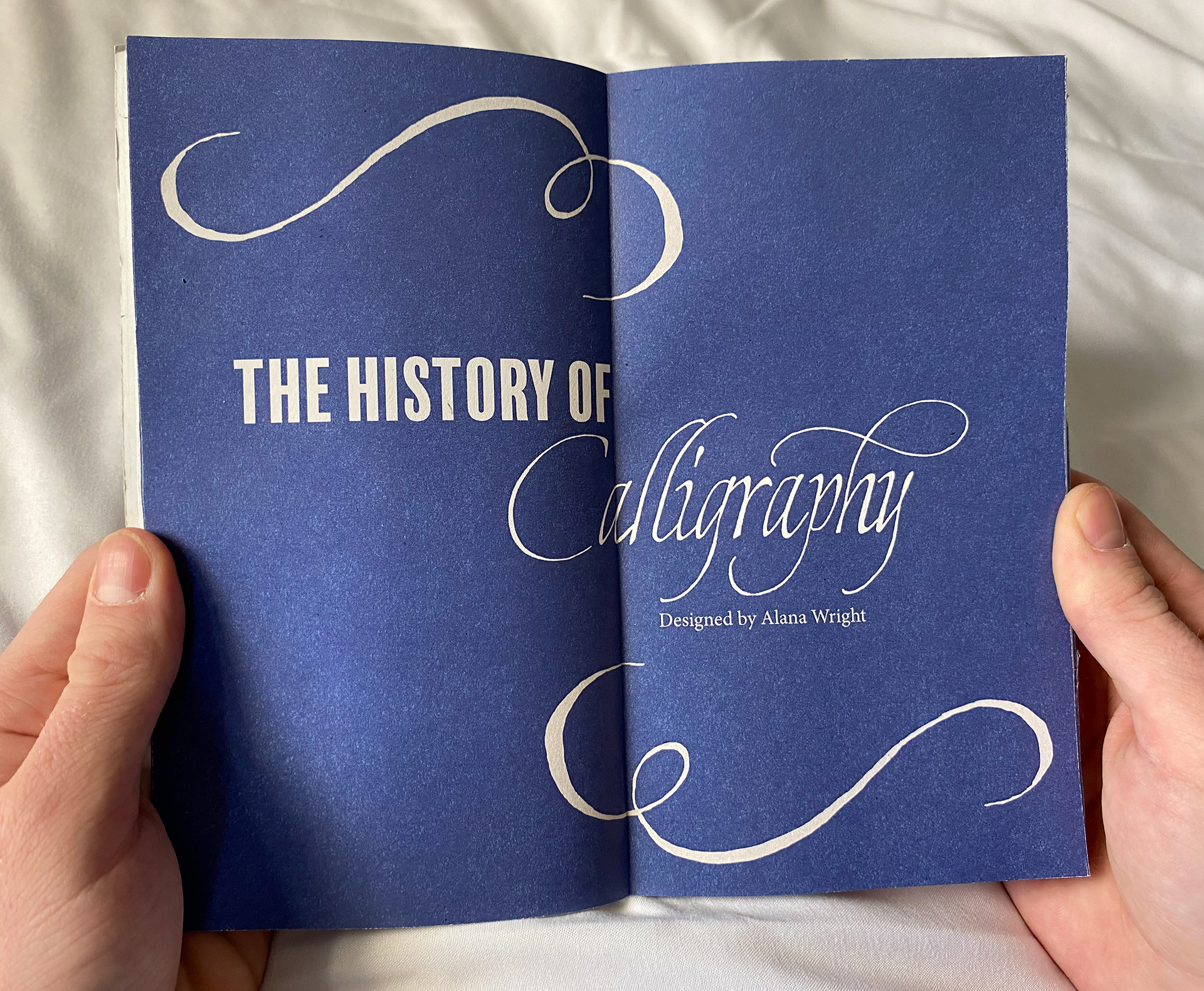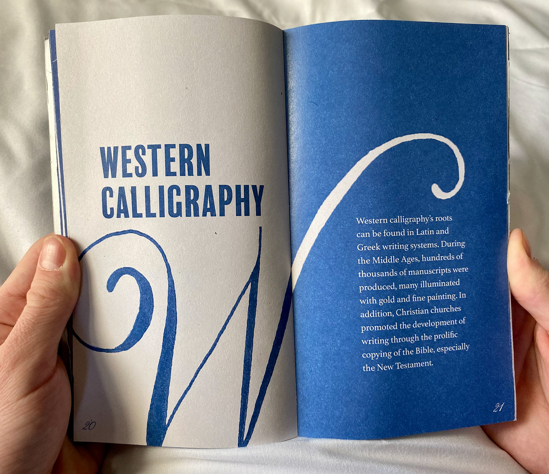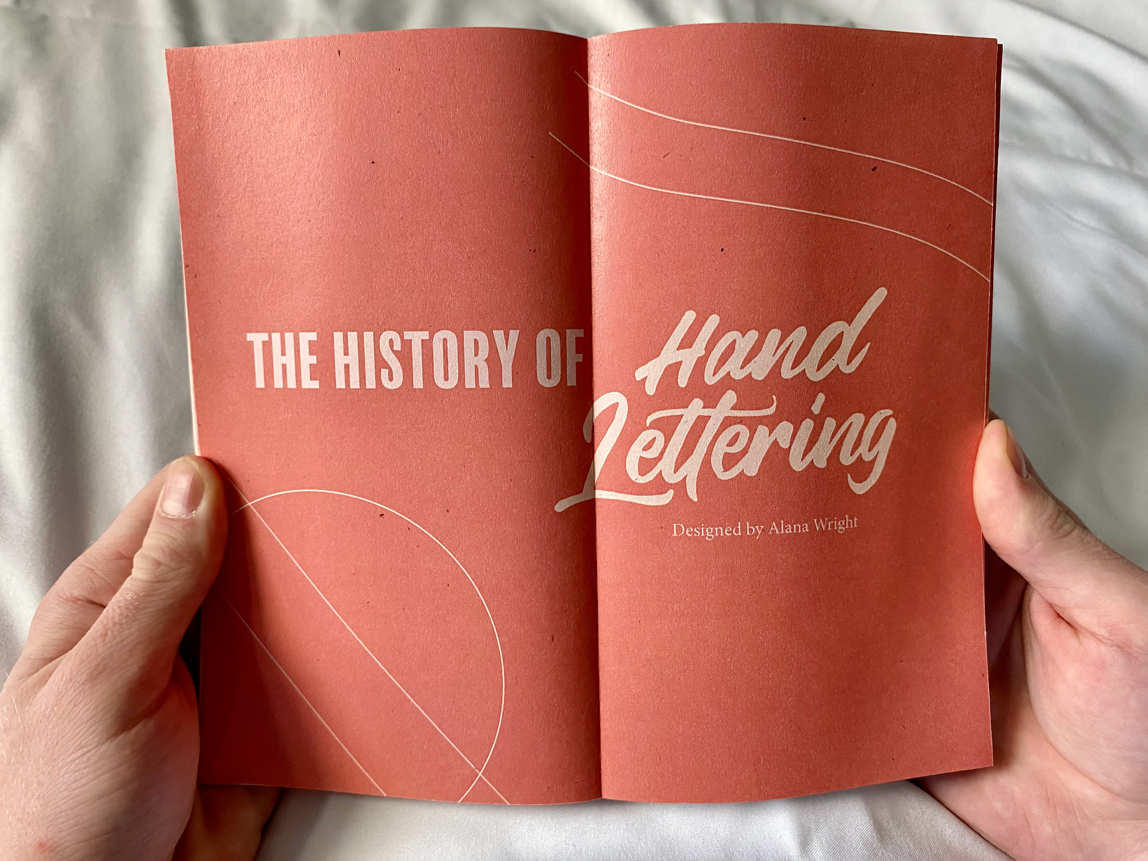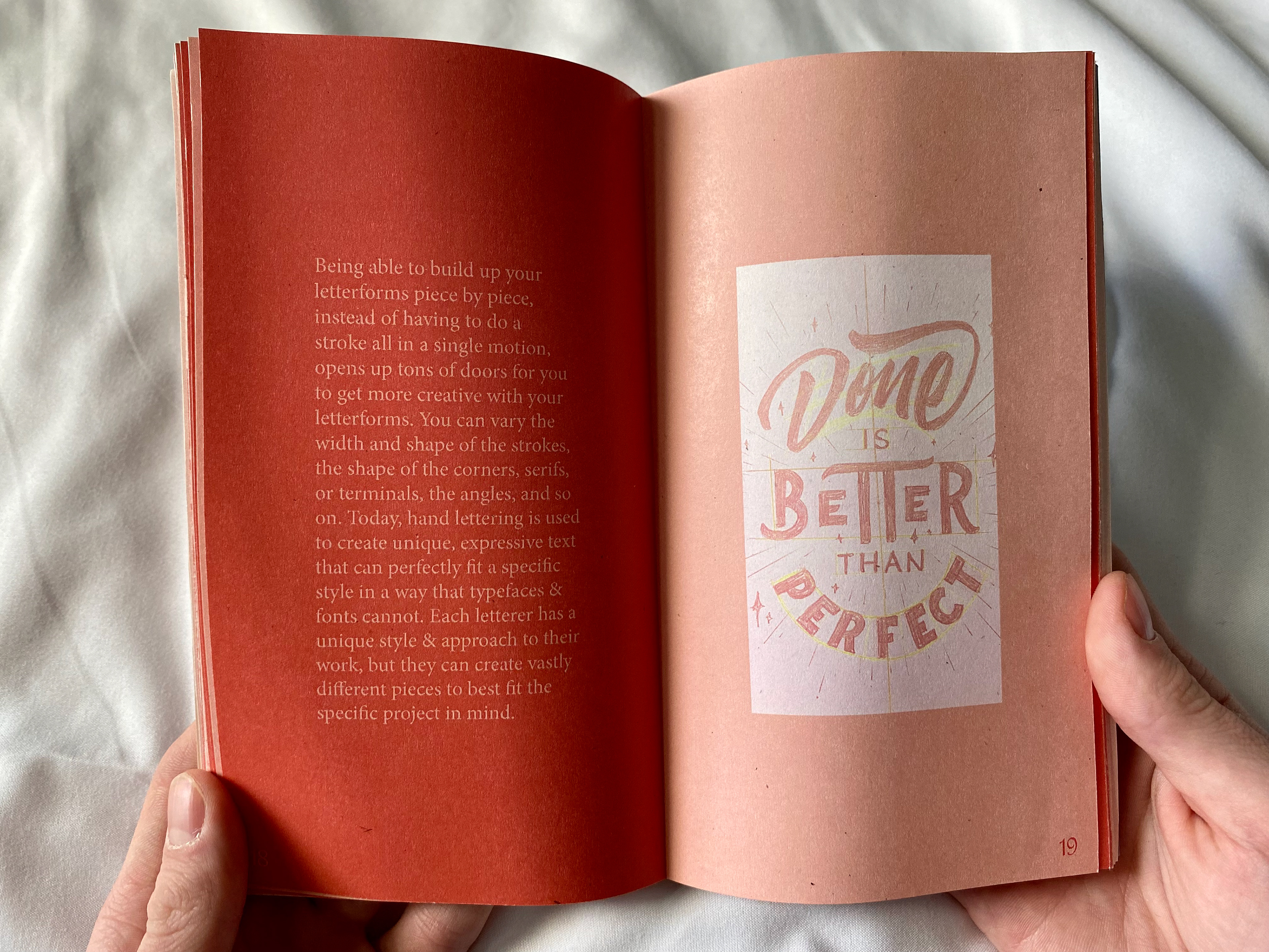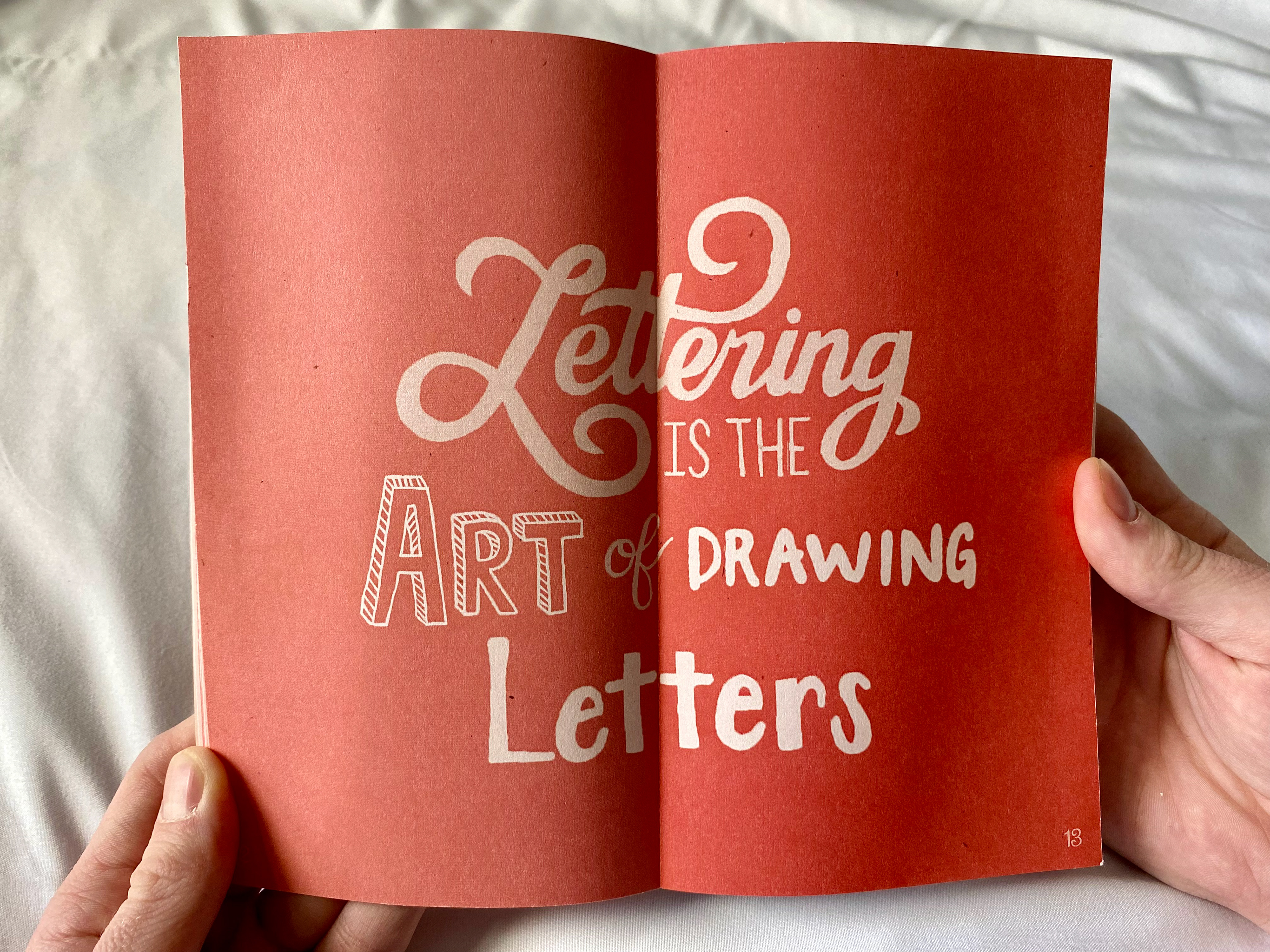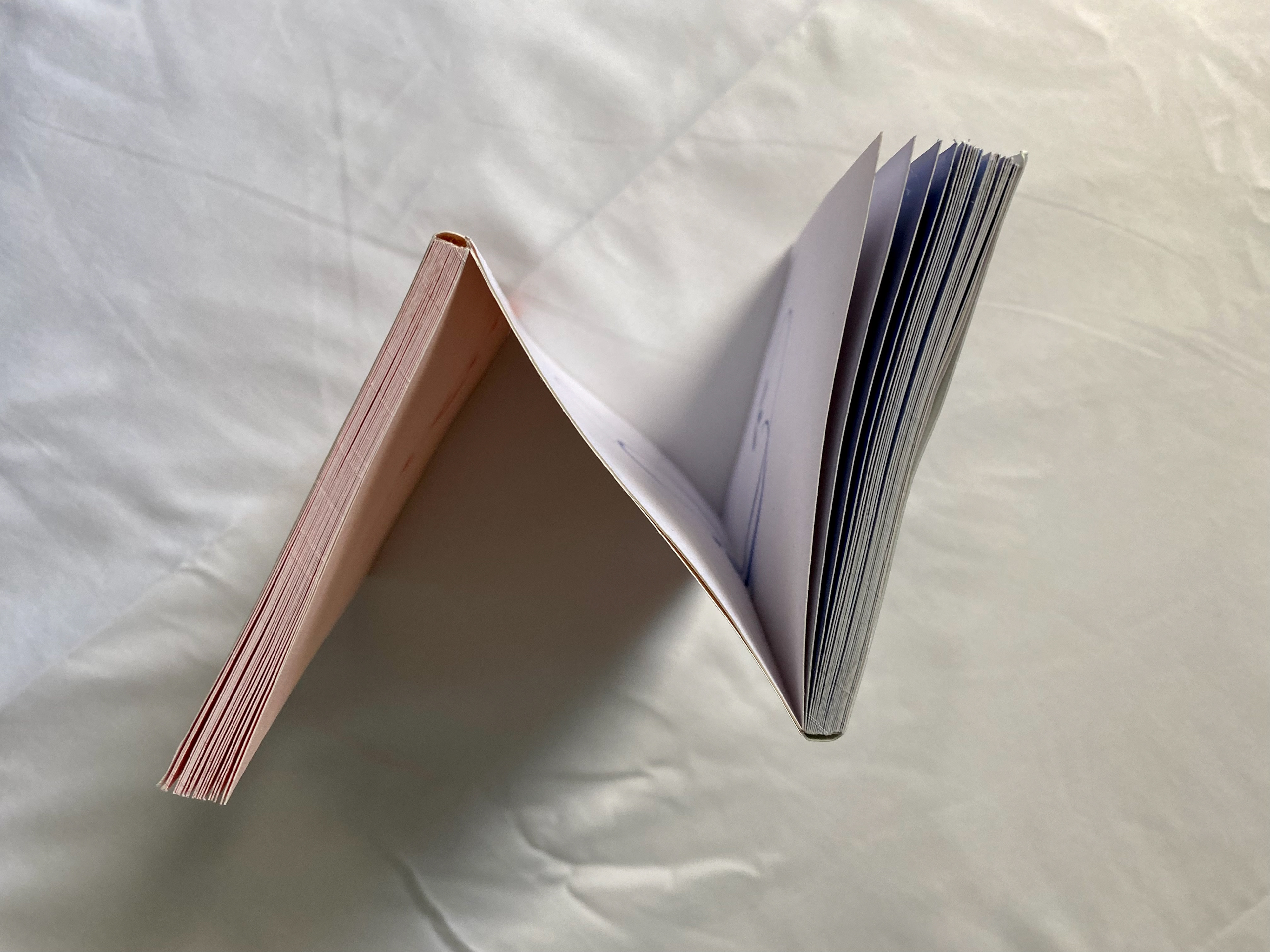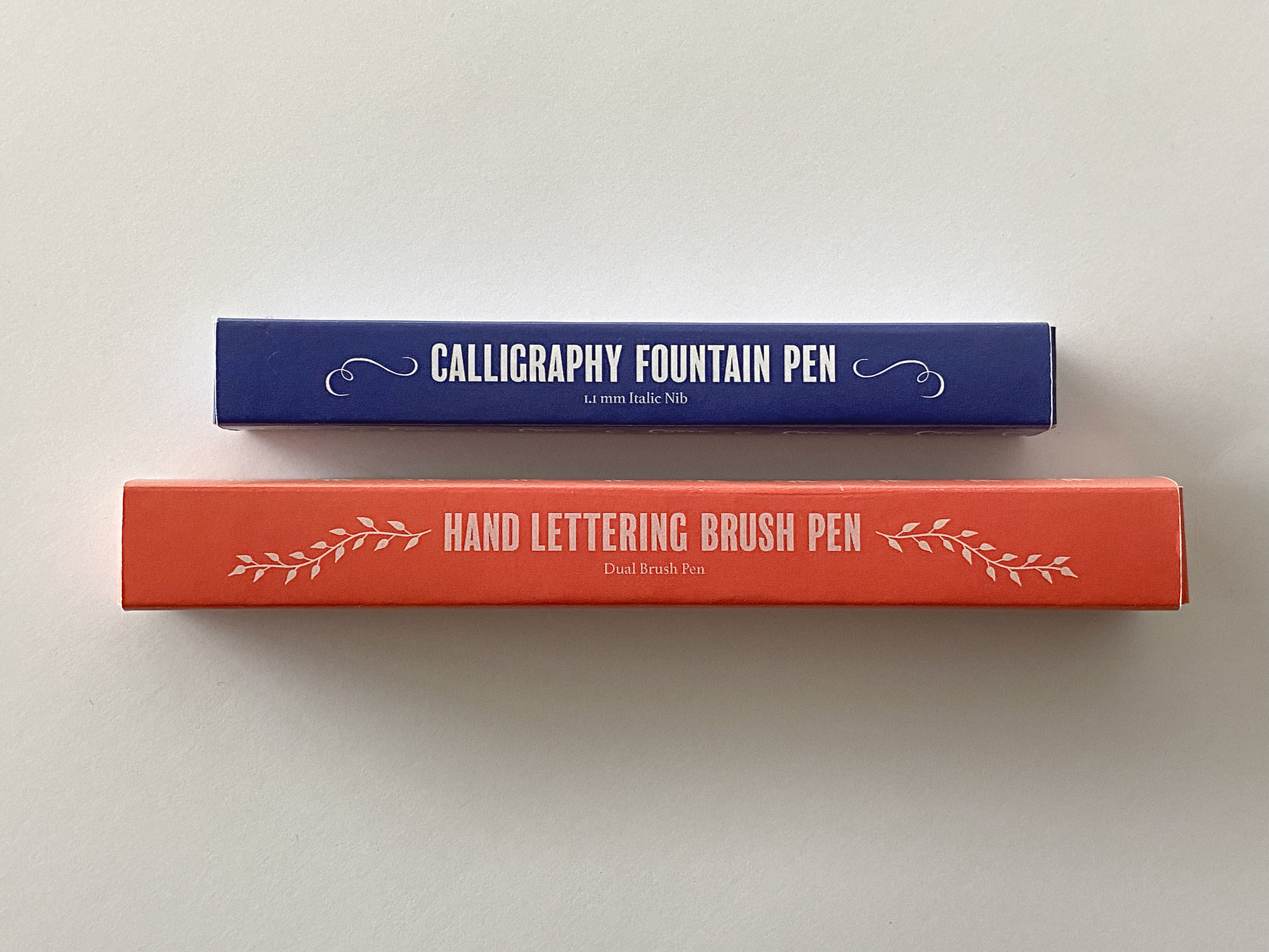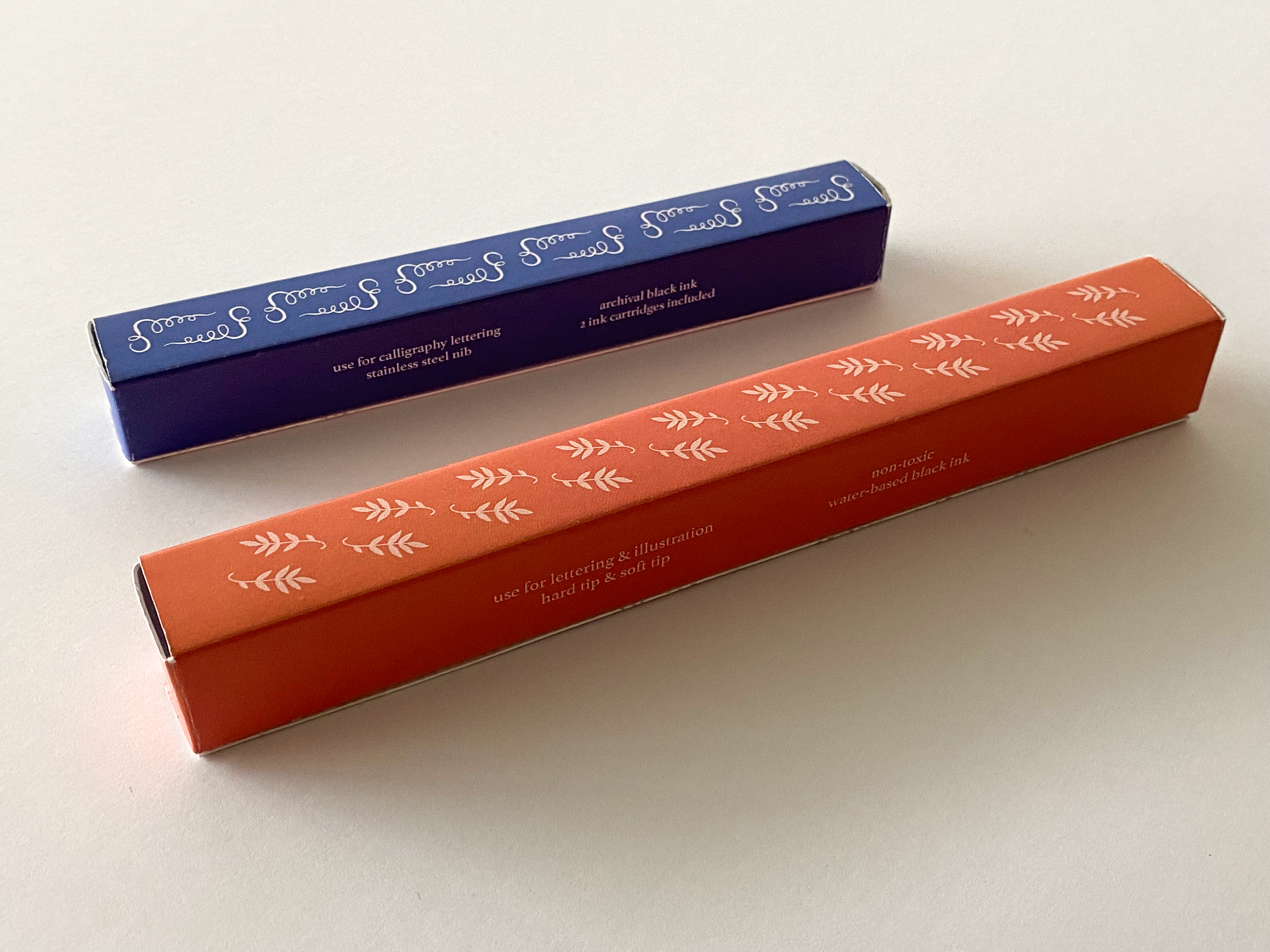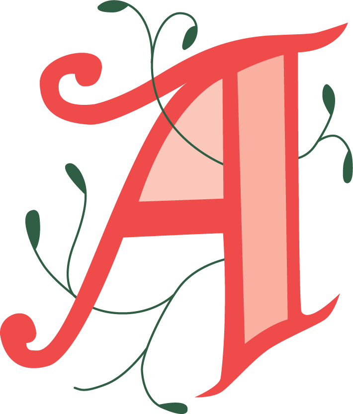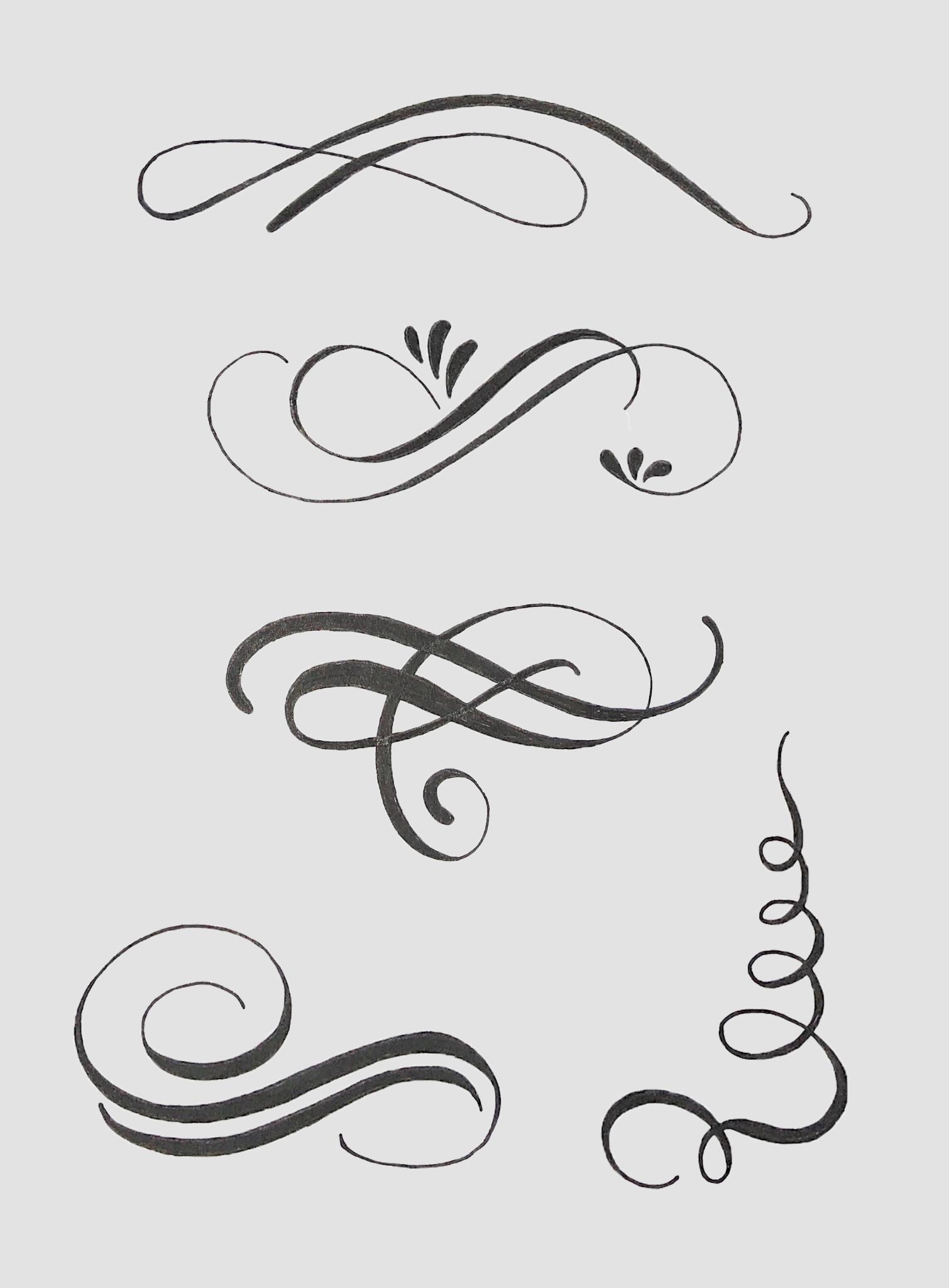


This chapbook is on the history of calligraphy and hand lettering. When I was 16 years old, I began to teach myself how to do hand lettering. For the past six years, I’ve been practicing both calligraphy and hand lettering, and I’ve grown to love it. I decided to use do-si-do binding for my chapbook in order to separate the two subjects. Each side is a different monochromatic color scheme because I wanted to keep everything minimalistic and cohesive. I used the complimentary colors coral/orange and blue for everything in my book. I drew and wrote all of the letters, drop caps, page numbers, and flourishes/embellishments for both sides of my book. The typefaces I used were BalboaPlus, for my headings, and Athelas, for my body text. I created two pen boxes for a calligraphy fountain pen and a hand lettering brush pen for my packaging. I sized the boxes to fit both pens evenly and used the same fonts, colors, and decorative elements as my book to make them connect. My chapbook shows how writing and lettering has changed throughout the years and how it’s done. My packaging shows the different tools that can be used to write and draw letters.
