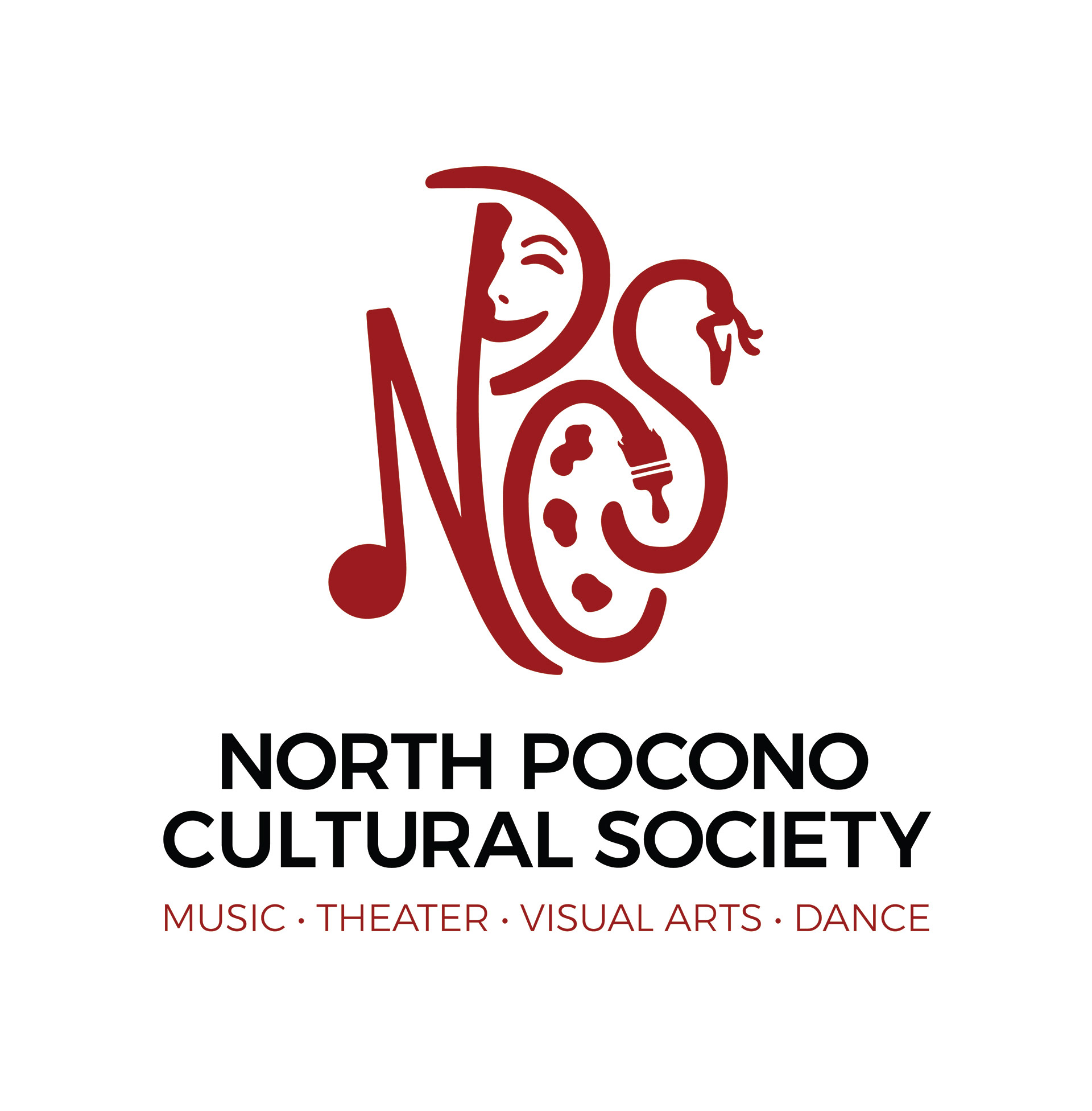
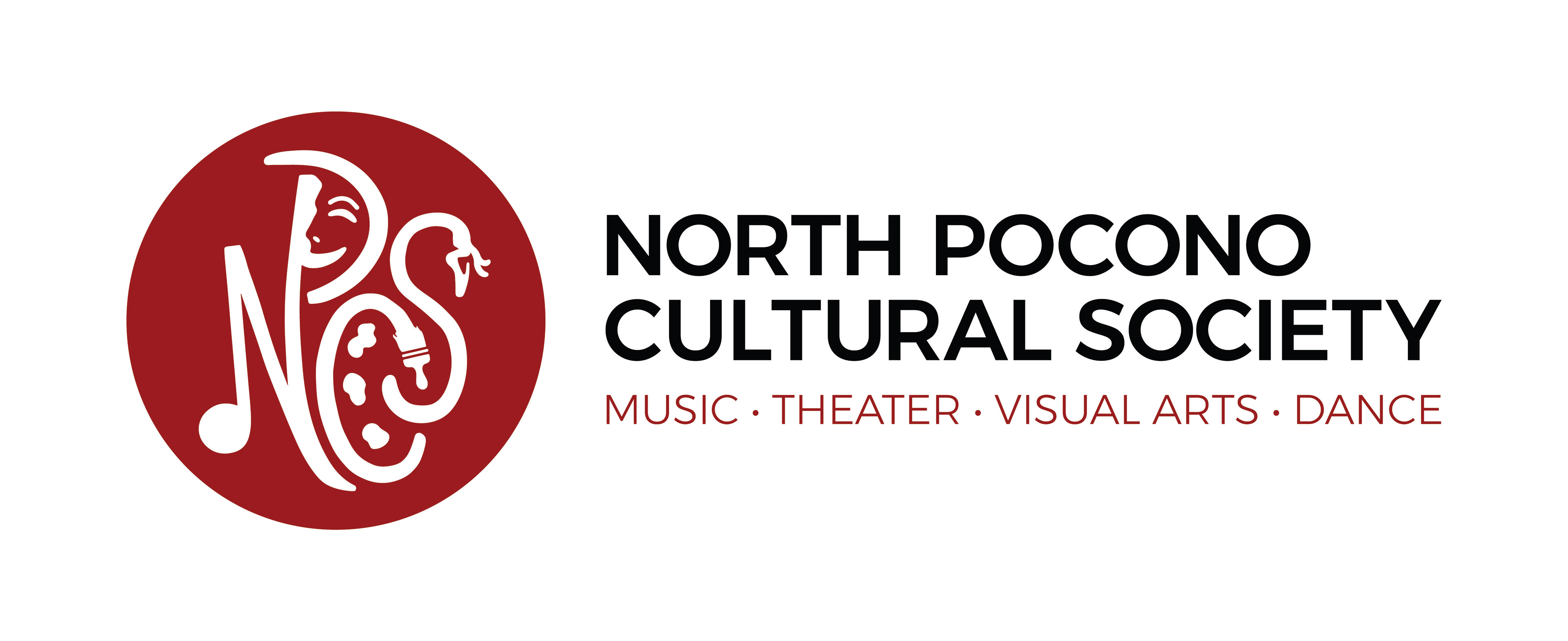
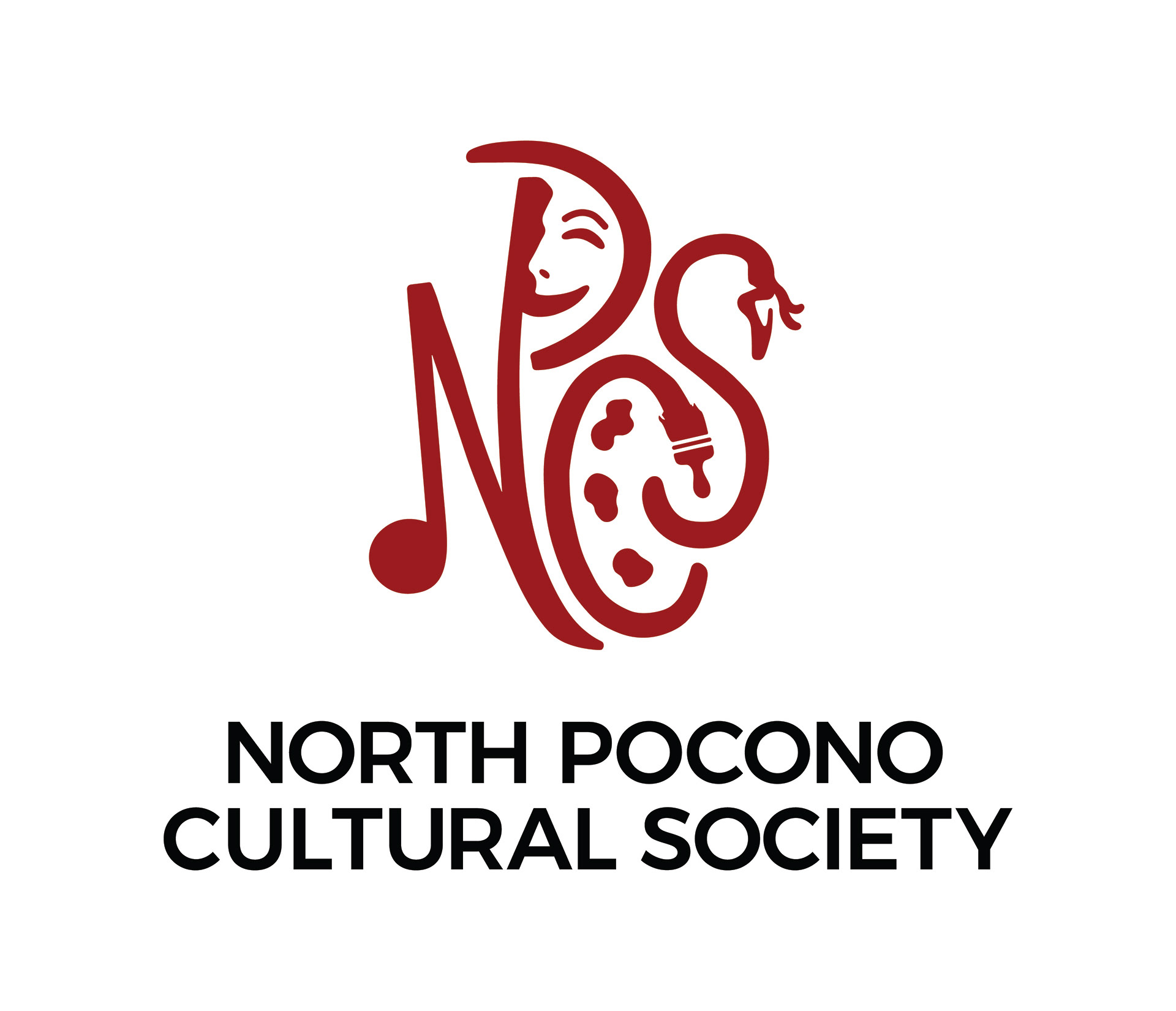
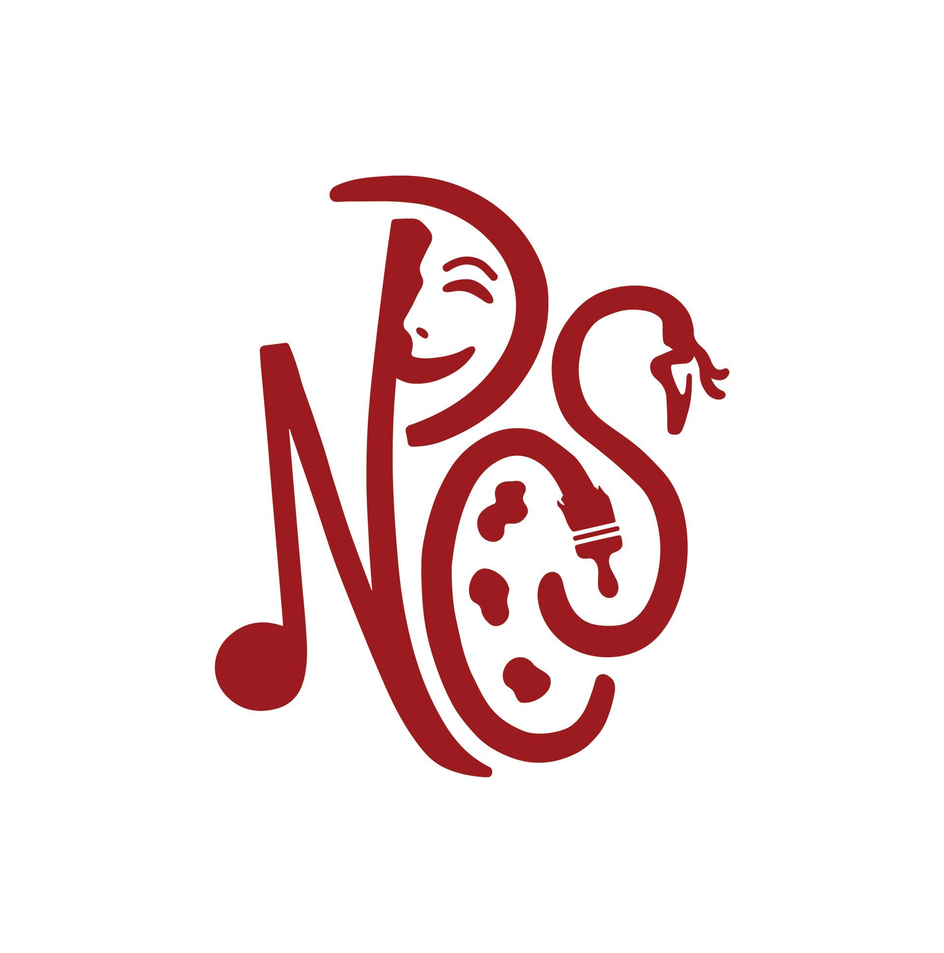
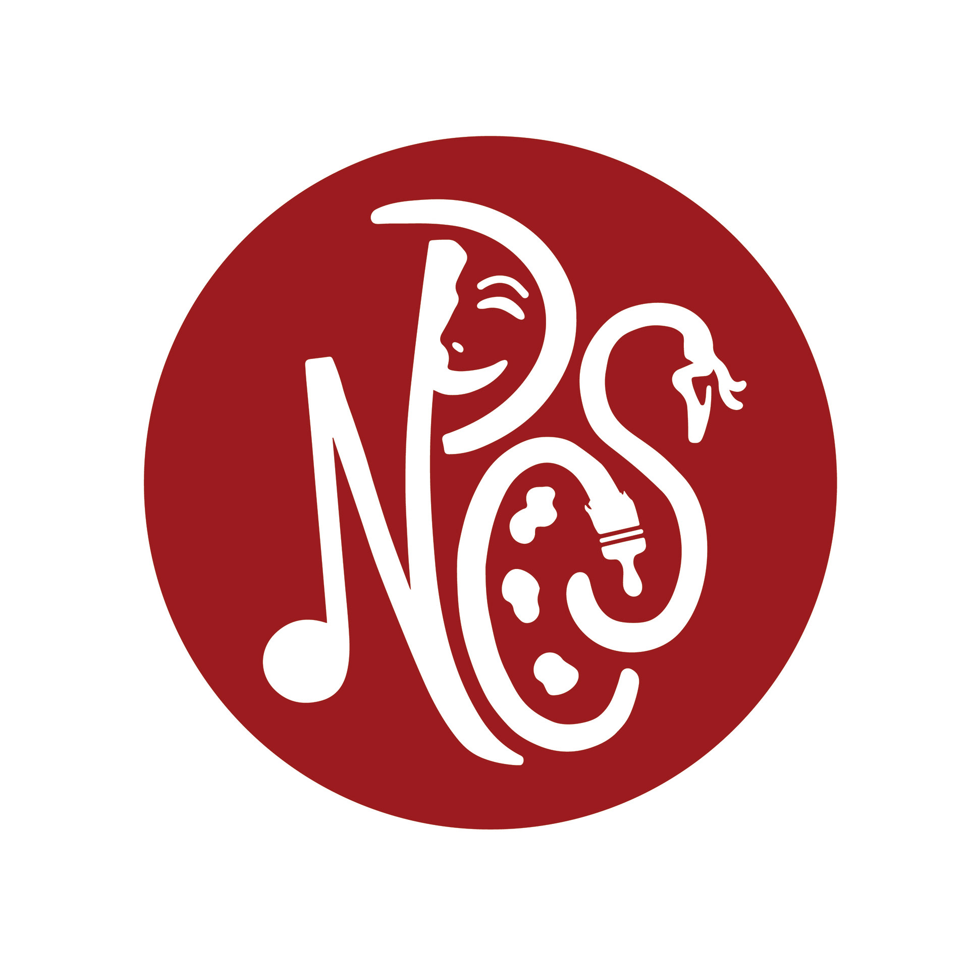
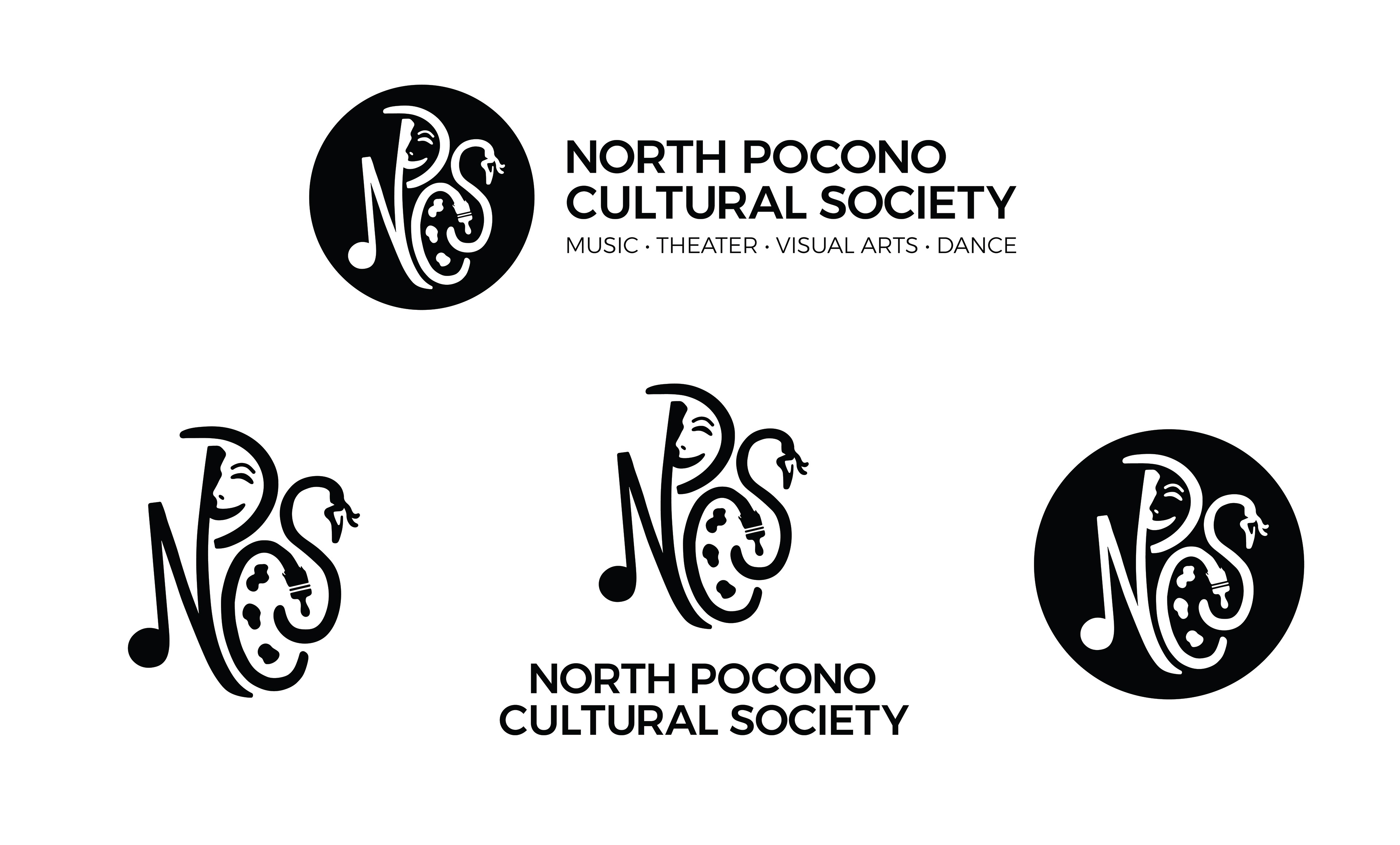
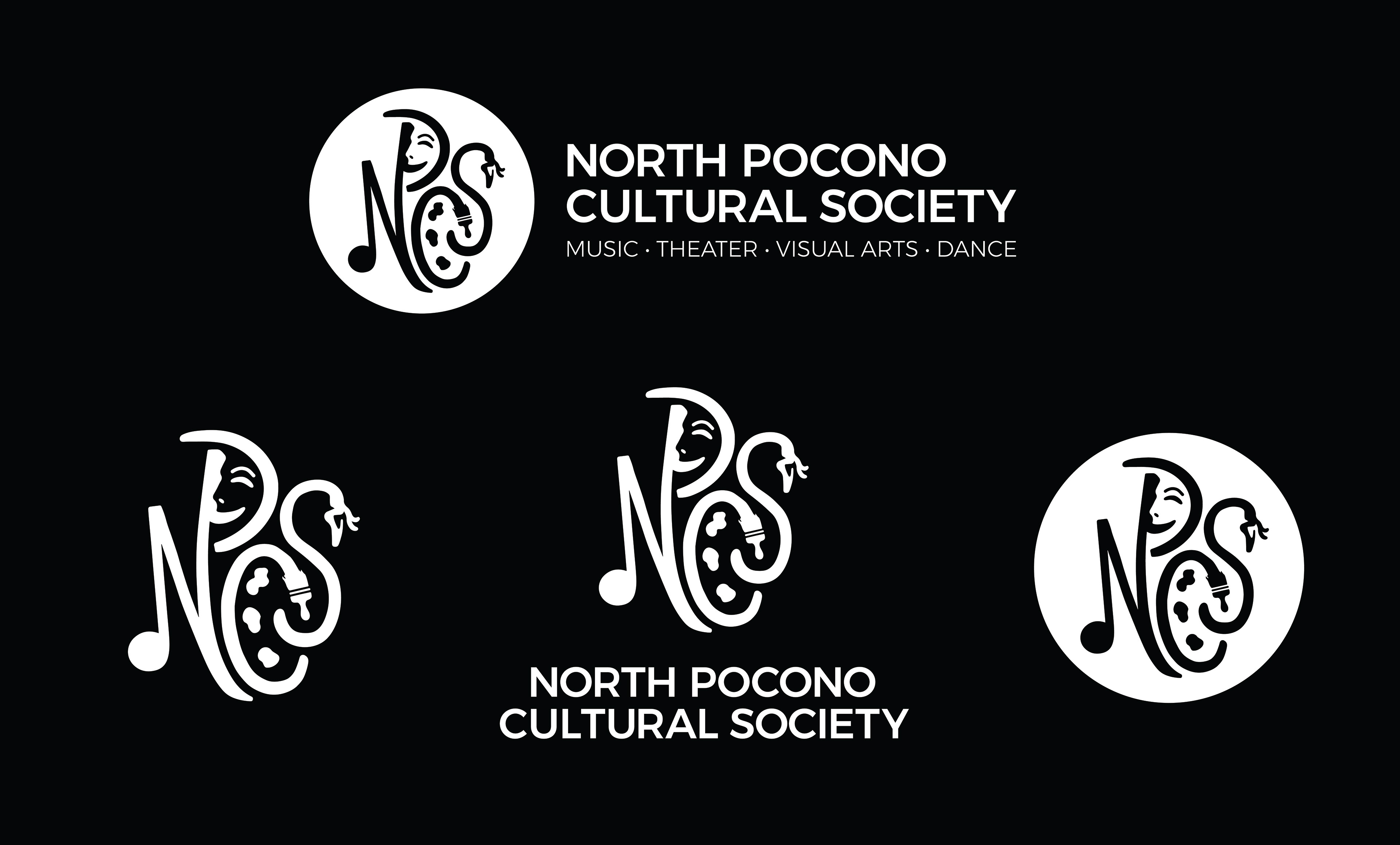
My design consists of the society's acronym (NPCS), but encompasses all areas of the "Arts" in iconography within each of the four letters. The N represents music, the P represents theater, the C represents visual arts, and the S represents dance. The lettering in the logo mark is all handwritten and spaced evenly for each letter to have enough negative space and is legible at a large and small scale. I complimented the logo mark with a simple sans serif font for professionalism and cleanliness. I added a simple tagline underneath "North Pocono Cultural Society" for more emphasis on who the organization represents. The logo can live in multiple different marks and layouts. I kept the color palette simple with a deep red and black to fit with our North Pocono community's typical style.
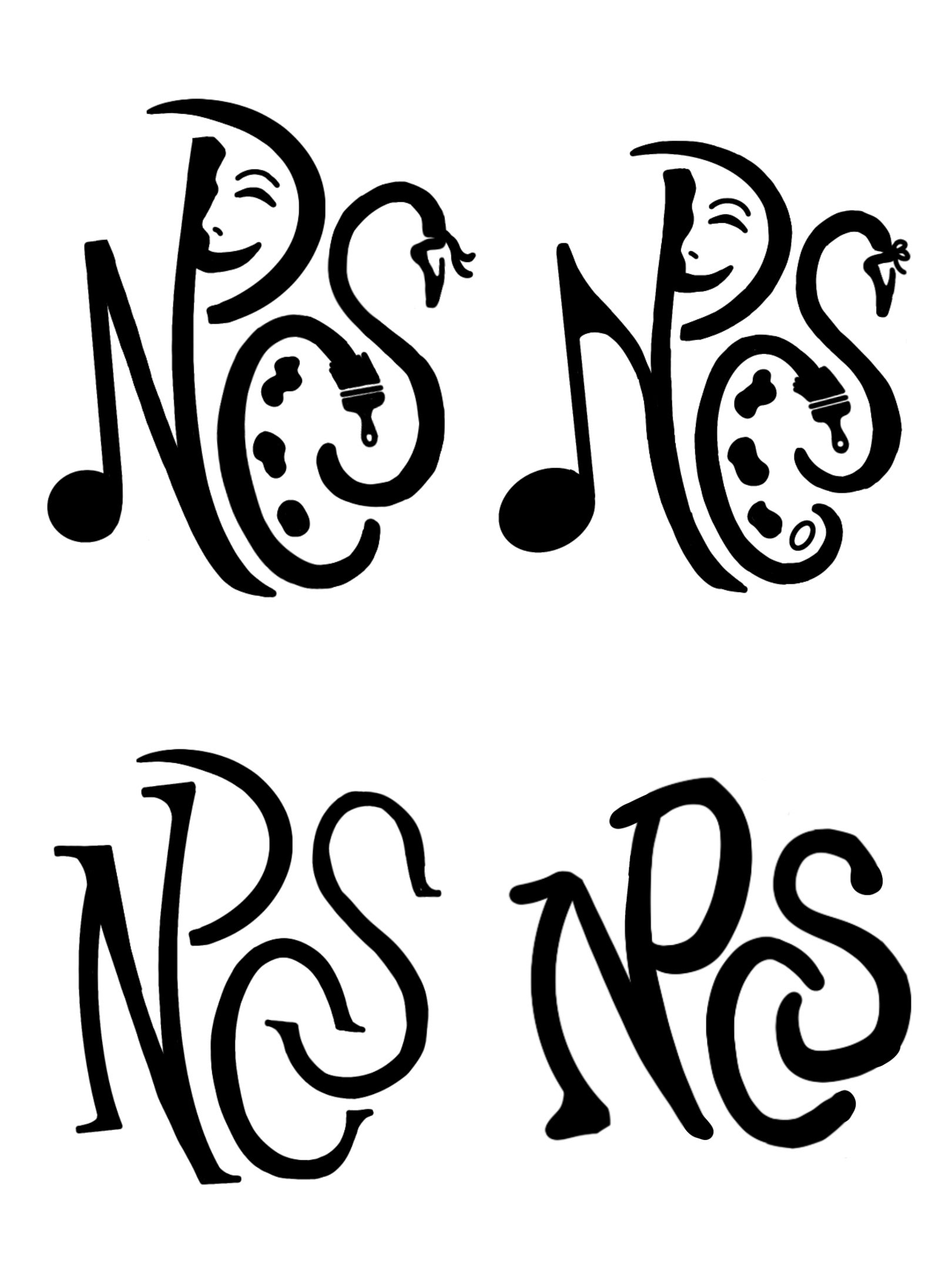
Original Acronym Sketches:
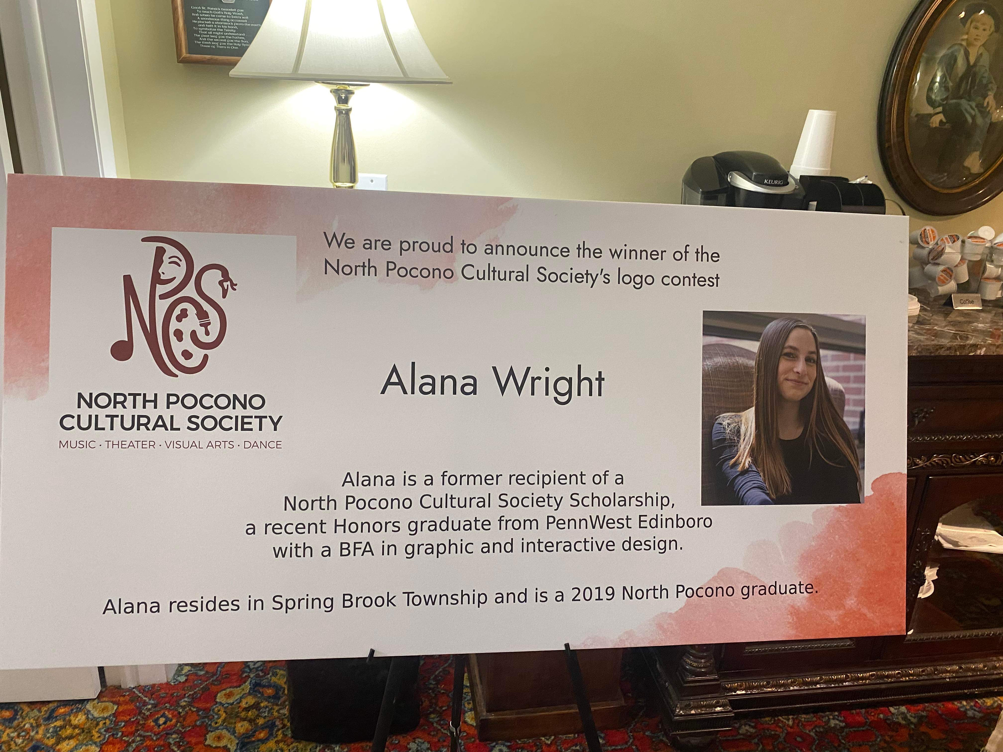
I received notice on June 12th that I won the contest, and my logo will be displayed at the Moscow Street Fair at the end of July for the community to see!